Monday, 20 August 2012

The Rebirth of Maryland Avenue


                                                                                                              Maryland Avenue Small Area Plan (DC Office of Planning)


For any lover of cities it is immensely gratifying to see a town recover something that once was thought lost. That is the spirit of the European cities ravaged in World War II—Dresden painstakingly reconstructing its bombed Baroque monuments,  Florence recreating Michelangelo's Ponte della Trinitá, stone by stone. 

Even in America, where so much has been pointlessly destroyed, we  have managed to claw a little back. Badly designed, disfiguring freeways have been removed in San Francisco, Milwaukee and other cities. Gracious neighbourhoods and Main Streets have been rescued from decay. 

Right now in the nation's capital, momentum is building to undo one of the classic disasters of the postwar decades, and restore a little of the integrity of Pierre L'Enfant's original city plan. 

Everyone knows Pennsylvania Avenue, the broad boulevard that connects the Capitol and the White House. Its symmetrical counterpart on the other side of the Mall, though, has slipped into obscurity. Maryland Avenue ran between the Capitol and the Potomac shore, where the architect had assumed a commercial port would grow up (it's now a marina and the Tidal Basin)

Maryland took some hard knocks over the years. A railroad was run down part of it, and eventually half the street disappeared, dug away for a railway trench. After World War II, most of the surrounding neighborhood was destroyed and replaced with massive and unlovely federal buildings. Maryland, or what was left of it, became a government ghetto, a desert outside office hours. 

Now, however, the District of Columbia and the National Capital Planning Commission have come up with some exciting plans not only to restore the street, but to bring some new life to the area around it. 

The big idea is to deck over the railroad part of Maryland, thus restoring the entire axis from the Capitol to the Potomac. Along the way, the plan identifies unused and underutilized lands facing the avenue (waste spaces left from the Modernist, superblock planning of the 50's) and proposes to assemble them for residential and commercial development. Done with a sympathetic hand and a minimum of intrusive planning, it could lead to the creation of a new neighborhood centerpiece and an inviting new streetscape at minimal public expense.

Continue up Maryland towards the Capitol, and things really start to get interesting. This is where the plan runs smack into something big, something that lately has been very much in the news—the proposed Eisenhower Memorial. 

No design for a public monument within memory has created so much controversy. Its critics see the closed competition as profoundly undemocratic, in fact rigged by the Memorial Commission to smooth the way for Frank Gehry to get the job. Gehry, who has never designed a monument,  delivered a jejeune and frivolous plan—also a hugely expensive one, filling an entire block with pastiches and images from Eisenhower's career. The effect is reminiscent of some elementary class exhibition, with photos and collages pasted to colourful construction paper. 

Instead of coloured paper, though, in this case Gehry is proposing giant metal screens with images taken from historic photos. One critic has likened them to concentration camp fences.  Reactions have been startling. The entire Eisenhower family is screaming bloody murder.  Powerful figures in Congress are promising to hold up all expenditures for the thing if it ever secures final approval; the Memorial Commission itself has already been defunded by the House. 

Critics of a traditionalist bent have been unanimously brutal, and Mr. Gehry has found small cheer even among the Postmodernist coterie. But one of the most serious flaws in the Memorial design was hardly ever mentioned. Paul Knight, an architect who blogs on urban design, was one of the first to spot the obvious:  Gehry's concept was completely lacking in context.  

Postmodernist architects, like their Modernist predecessors, seldom if ever give any thought to the site of what they're building, or how it will live in harmony with its neighbors. The Memorial site actually includes a part of  the original Maryland Avenue. Decades ago, for reasons not entirely clear, traffic engineers had mangled the original course of the street and its intersection with Independence Avenue. In the first version of the plan, Gehry may not have even noticed the grand axis of L'Enfant's Maryland Avenue on which he was encroaching; or else, he chose to act as if it wasn't there.  On his second try, he added rows of trees where the avenue should have been, which didn't help things much. 


                                                                     *     *     *     *     *
                                                                                                                                                                          —Paul Knight

Knight's very attractive idea is to restore this part of Maryland as a divided street, with a broad centre strip that would provide a proper site for a redesigned Eisenhower Memorial (roughly in the centre of the above plan). What is more, the restored axis from the Capitol could serve to site future monuments. As he puts it:  'Each new memorial would reinforce the next just as they do on Commonwealth Avenue [Boston] and Monument Avenue [Richmond]. Maryland Avenue would become a physical succession of history'.

The Gehry design smells dead right now; its very preposterousness, not to mention the wave of revulsion it has raised up across the country, suggest this might be a turning point in the way we look at public art and design. Knight's idea points the way to a civilized alternative. And it could be the cherry on top of what is looking like a delightful rebirth for Maryland Avenue and its neighborhood.  


                                                                                                                                  —DC Office of Planning


Saturday, 3 March 2012

More News from Barcelona


Down at the Ajuntament, Barcelona’s planners never sleep. For years now, they’ve been working on hugely ambitious plans to make this the most technologically advanced city in the world. The latest step, unveiled March 1st, is a partnership with Cisco Systems to create something called the ‘Barcelona Institute of Technology for the Habitat’.

The city is committed to building a new campus for it in the heart of it’s rapidly-developing high-tech district ‘22@’ (pronounced vint-i-dos arroba), near Plaça de les Glòries Catalanes and Jean Nouvel's Torre Agbar. ‘BIT for the Habitat’, as they call it, will be a centre for research and education into ways technology can improve city life. For Cisco, it’s enlightened self-interest. They make software and systems, and they want to help cities learn to use them in the same way that GE, Westinghouse and other firms helped wire cities for street lighting over a century ago.

For Barcelona, it’s all part of an umbrella plan called Barcelona Smart City, which hopes to use the latest technology to promote sustainable development and make city services more efficient. Since 2008 they’ve begun 43 pilot projects: redoing the street lighting system with LED technology, installing charging points for electric cars, smart metering for gas, electricity and water, a computerized system to lead drivers to available parking, and more bike lanes on the streets. They have plans to make better use of the rain water that falls on the city, to start a system of electric and solar-powered motorbikes for public use, and to create entire city blocks that are self-sufficient in energy.


Friday, 10 February 2012

And Now the Bastards Want to Wreck My High School
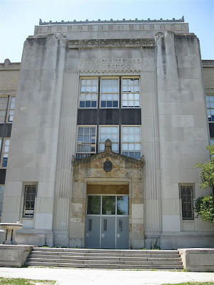


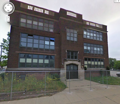
photo: Aaron Turner, oldohioschools.com
It wasn’t exactly Plato’s Academy, but back in the early 70’s when I infested its halls John Marshall High School on West 140th in Cleveland was a pretty decent school—the one high school left in the once-proud Cleveland system that could match the suburban schools academically, and in fact surpass most of them.

On 12 January, the Cleveland Landmarks Commission voted 5-4 to lift the building’s landmark status and pave the way for its demolition. The vote came as no surprise, though it does reveal the lack of seriousness, and the political ties of the Commission. Mayor Jackson, effectively in charge of the schools, wants it down, and so does the lowlife Council President Martin J. Sweeney, who represents the school’s neighborhood. A new building, they say, will ‘appeal to residents’. They’ve already got some architects’ drawings of the new John Marshall ready. It’s a typical low-budget shed, with the vague air of a small factory office, or a bowling alley.

The politicians probably mean well. In the bovine way of Cleveland pols, they go along with whatever the functionaries of the school system want, and in a depressed city, any shiny bauble of new construction is like candy for them. The real villains here are the functionaries, the class of faceless administrators that has driven big-city school systems like Cleveland’s down into the gutter over the last forty years.

Disposing of perfectly good old schools, built with pride and built to last, has been a scandal for decades, in Cleveland and across the nation. There has always been a strong lobby for new construction in the public sphere. The state and federal governments that supply funding reinforce this prejudice; these, without exception, have always pushed for rebuilding as opposed to restoration and reuse.

When school officials tell you that constructing a new building will actually be cheaper than restoring the old one, take it the same way as you do when a car salesman explains how you can’t afford not to buy the new model. Christopher Busta-Peck, who blogs at Cleveland Area History has uncovered some of the deceptions used in Cleveland: overstating the floor area of the old buildings to inflate estimates, and leaving the costs of demolition and environmental abatement out of the sticker price.

They feel they have to lie, perhaps, since the vagaries of state funding rules make it so hard to get money for restoration. The National Trust for Historic Preservation’s report, State Policies and School Facilities recounts the obstacles to restoration placed by state rules in precise and depressing detail. Our neighbor Pennsylvania gets praise for getting rid of some of those rules, while backward Ohio is singled out for a special scolding.

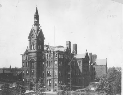
This is how Cleveland lost scores of treasures from its early years, such as Central High School (where Johnny Rockefeller learned to keep a ledger), Lincoln High and West High.


More recently, the administrators who turned Cleveland’s schools into a civic embarrassment have declared unceasing war on all the system’s older buildings. The schools Cleveland built in its Progressive era, c. 1900-1930, are something special: model schools designed in-house to the exacting standards of what was then America’s most forward-looking big-city system.


Here’s one of them: Almira Elementary. Yes, it’s personal; this was my school too. A real people’s palace: the kindergarten had enormous curved bay windows with window seats for reading, also a piano, a fireplace, and an oil painting of Columbus’s three ships. Almira has been scheduled for demolition; it may already be gone for all I know. The photo below is enough to show the indignities the school bosses inflicted on it before its end:


This is barbarism. The brand of educated, progressive barbarism that right now is raising up yet another generation of functional illiterates has wrought havoc on the architectural heritage of the city. The streets around West 98th and Almira remain a calm, stable and agreeable working-class neighborhood, something increasingly rare in Cleveland. The school administration created this cancer in the heart of it, and you may imagine the effect it has had on the people who live there, and on outsiders’ perceptions of the neighborhood.


The way they treat buildings is a mirror of the way they treat children. Almira’s students have been forced to attend Brooklawn School, a few miles away, until their new shed is built; previously they had been in Nathaniel Hawthorne, until serious deterioration was found in that building . The system planned to put some Marshall students in Brooklawn, but now they can’t. A thousand or so will be in Carl F. Shuler. This sort of surreal musical chairs has become common in Cleveland, as plans are reformulated and schools change names with each passing year.

School administrations change too; one faction succeeds the other with brave talk about new beginnings. What each has had in common, over the last four decades, is monumental incompetence. As they dumbed down the curriculum, according to the fashionable theories of the day, they have reduced the system’s physical plant to ruin. The dangers found in older buildings are not natural, but in every case the result of neglected maintenance—this, in a district that has far more money to spend per pupil ($14,573, in 2009-2010) than most of its suburban neighbors.

Instead of knocking down perfectly good buildings, it might be more appropriate to put the wrecking ball to the Cleveland Metropolitan School District itself, and to the entire class of self-styled educators—administrators, academics, union bosses and the whole buzzing swarm of blood-sucking ‘consultants’ and ‘experts’— that have created bureaucratic empires and enriched themselves while making the schools Cleveland’s greatest shame. Morally bankrupt and intellectually corrupt, neither they nor their empires can be reformed.

Keep the buildings, keep the schools and their heritage, but tear down this system. Destroy this incorrigible symbol of failure completely and see that the people who have served it so ill never find places on the public payroll again. The sooner we do that, the sooner we can clear the ground for something fresh and green, something honest and full of promise.


Sunday, 29 January 2012

A New Center for Barcelona
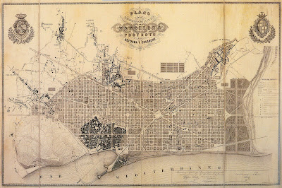

Where does Barcelona get all the money? Better not ask, unless you’re a Catalan taxpayer. In this city with more ‘cultural centers’ than some dogs have fleas, every year seems to bring another publicly-financed megaproject. A Barcelona reviving after the death of Franco started its edifice complex in the 80’s, gearing up for its date with the Olympics. They really haven’t let up since, despite the dubious architectural quality of most of the results. But this time it’s different. Barcelona is up to something really big, and for once, it looks like they may get it right.


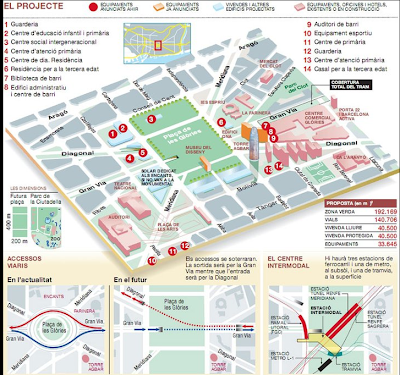
The Plaça de les Glòries Catalanes was conceived in Ildefons Cerdà’s great 1859 plan for the Eixample (‘extension’). That’s it in the center of the plan, below, at the spot where Avinguda Diagonal and the Gran Via meet. Cerdà meant it to be the center of the new Barcelona, but he would be betrayed by shifting patterns of fashion and real estate. The Square of Catalan Glories became a tawdry urban backwater, famous only for changing buses, and for the huge, surreal flea market called Les Encants that still, for the moment, graces its northern side. Eventually, Franco slopped a mess of concrete road junctions around it.

Barcelona resolved to fix up the Glòries in the 80’s. In those days, a city bursting with cash and energy was convinced it had the architectural and artistic talent to match. Barcelona was wrong. Nearly all of its early megaprojects were hideous flops, and none more so than the rebuilding of the Glòries. Here, a demented architect simply rearranged Franco’s auto flyways into a giant traffic circle in the sky, propped on concrete piers that covered most of the square. City Hall was promised that the people would delightedly gather underneath and perhaps open up cafés and dance sardanas; instead it rapidly became a spooky, crime-ridden wasteland. Within a few years of its opening, locals were screaming for its demolition.

Now they’ve got their wish. Photos of this incarnation of the Gloriès can still be found here and there on the web, though one suspects the Barcelona municipality is secretly buying them up to hide the evidence. Now they’re doing it all over again, at a cost of over a billion euros, and this time good, simple planning and a massive revival of investment in the area have coincided for a new Glòries that soon might become one of Europe’s iconic urban spaces.

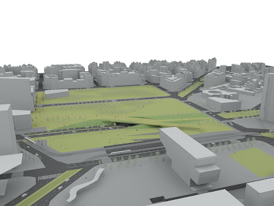
As Boston learned with its Big Dig, the simplest and best solution was also the most expensive and nerve-wracking: get rid of the cars. Here too, the only way to do that was to swallow them underground, not an easy job in a spot where three major roads meet, and will have to share the underground space with metro, tram and bus stations. On top, we’ll see a huge new park—the size of eight soccer pitches. How such a large open space gets landscaped, with all that infrastructure underneath, is a problem they’re facing now, and how it can be integrated into a dense city neighborhood without seeming a void remains to be seen.

Right now, though, the stars are aligning for the new Glòries. Jean Nouvel’s sparkling, LED-lit, 466-ft pickle, the Torre Agbar, was built here in anticipation of the Gloriès plan. Already it is a favorite with the Barcelonans; they’ve started spontaneously gathering here to mark the New Year. A prominent local architect, Oriel Bohigas, is building an intriguing Museum of Design (DHUB) in the park, while the old industrial area to the south is being transformed into ‘22@’ (say it ‘vint-i-dos-arroba’), the city’s growing IT and arts district. A major shopping center is in place, and plenty of other private investment is lined up waiting for this pesky depression to go away.

Barcelona, the urban compulsive exhibitionist, is at its best with things that are preposterously colossal, over the top, out of scale (and when they say a billion, pencil in three; development here works just like anywhere else). In the past, Barcelona has often found a way to make its follies pay off. Another part of the Cerdá plan, the Plaça de Catalunya, is one of the biggest squares in the world, but you never seem lost in a vacuum there. The odd shape and the edgy 20’s commercial buildings around it make it a visually unforgettable place, and it’s always full of people. Maybe, with a little help from some second man Barcelona will get lucky again.


Alamedas and Ramblas II: the Promise


Can alamedas be adapted for American city centres? Why not turn the asphalt desert of a ridiculously wide American main street into a linear park like Barcelona’s Ramblas? Why indeed—in big cities or small towns, civilizing a too-wide street could be just the tonic a town centre needs. But there are always some complications in translating an element of urban design from one culture to another.

It’s been tried, in a fashion, and without any influence from Spain. Commonwealth Avenue in Boston’s Back Bay, a planned neighborhood of the 1840’s, has a central mall full of trees and benches that adds considerable grace to the area. But Commonwealth is a largely residential street, and a rambla only works the way it’s supposed to in a town centre where there are lots of people about.

A later experiment with a linear park would turn into a civic embarrassment for decades. New York’s ham-handed boy genius Robert Moses gets the credit for the Sara Delano Roosevelt Park on the Lower East Side. For this, several blocks of insalubrious tenements were blasted away and replaced with a parkway to let some light and air into the neighborhood, following the planning dogma of the day. The space was too wide to work; primitive landscaping, lots of concrete and chain-link fences contributed to a grim anomie. Worst of all, Moses never considered that he was putting his park only a block parallel to the down-and-out Bowery. Within a few years of its opening all New York was snickering at his mistake. At tremendous expense, Moses had created a civic space named for the president’s mother, and populated exclusively by bums.

Today, as bums give way to hard-working Chinese immigrants and yuppies with backpacks, the park has become considerably more respectable. Most of it has been filled with playgrounds and sports fields; still a dowdy, rather unloved place, it continues to be a work in progress.

The next American experiment along these lines was the ‘pedestrian mall’; usually nothing more sophisticated than closing off a main shopping street and adding a few benches and planters. Kalamazoo pioneered this innovation in 1959, and by the 70’s it was a universal dogma of planning and revitalization efforts. The overwhelming majority failed, and few survive today (Fresno, Minneapolis, among others). Often, it was the shop owners who yelled the loudest about the malls. Since they were completely closed off to traffic, there was no more street parking, which drove away customers. It seemed a backward and uncivic complaint to many at the time, but the merchants had a point.

But there’s no reason why a well-placed and well-designed rambla couldn’t work in an American city. If you want to see one in your town, keep these desiderata in mind:

Get the form right: You’ll need a street where you can lay out a center median of at least 40 ft, perhaps not more than 60ft, and one traffic lane on either side—not more—plus one on each for parking, deliveries and taxi stands. Those in fact are the dimensions of much of Barcelona’s Ramblas, though it widens out in places.

Pick the right street. Naturally, this has to be a street that can stand being shorn of a few lanes of traffic—but that’s many American downtown streets. And there’s no sense building it if there isn’t any considerable pedestrian traffic already. Barcelona’s, which has no parallel streets for competition, concentrates people. The crowds pass by 24 hours a day, and you can buy nearly anything along the way. In the neighboring city of Tarragona, the Rambla Nova is a quieter street on the edge of the centre, wider and more formal. It has a delightful contemplative air to it; a more urbane space would be hard to imagine. Often a good choice is a street just parallel to a major thoroughfare, like the Rambla de Catalunya, the modern continuation of Barcelona’s Ramblas that runs parallel to the city’s posh shopping street, Passeig de Gràcia.

Keep it open; keep it simple: The same rules of street behavior William H. Whyte famously discovered in New York’s Bryant Park apply here. No visual obstructions, no hideaway bowers. Everything in plain sight. One thing to definitely avoid is fancy, too-clever design and landscaping.

Two lines of trees: One on each side. Plane trees, hardy and beautiful work well in most climates, as they do in Catalonia, and they give a shady cover. The French would pollard them, which can be charming. 

Go for quality: Good paving, not concrete. Elegant street furniture (for street lights, call the Union Metal Co. in Canton, Ohio, which never threw away the designs and casting molds from the the City Beautiful era of the 1900’s). This is an embellishment for your city, a place you want to show off.

Encourage life: This is the place for vendors of all kinds, for kiosks, for cafés—whatever there’s room for.

Just offhand, we can think of some possible candidates for the treatment. Upper Broadway, for one. Now, most of it has a wide median planted with shrubs, a bit daft in a city that can’t afford to waste space. Another in New York is Seventh Avenue in Harlem, at least the bit around 125th St. that isn’t entirely residential (but I wonder what the shopkeepers there would say about the idea). Cleveland’s low-traffic, 110-ft wide Superior Avenue, between Public Square and East 12th, would be perfect.

Architects John Massengale and Dover, Kohl and Partners have recently come up with an excellent proposal for a true rambla on Second Avenue at 86th in New York, for Urban Design Week 2011: the Yorkville Rambla.

Alamedas and Ramblas I: the History


photo: Jorbasa

Remember when you were in Spain. Remember how everything urban there was a just a little shinier, a little buzzier, than anything we gringos can manage. The town, in Spain, is your home, as much as your living room is, and Spaniards can be a little showy about their homes. The shop windows are catchier, the architecture more dramatic, the pavements sometimes bordering on the psychedelic. Amidst oceans of cologne, pastries and ice cream, the streets smell divine.

Nature simply isn’t much fun for months of the year in these dry, subtropical climes, and narrow, shady whitewashed alleys are refreshing always. Here, cities can seem like oases in summer, while country picnics are nearly impossible. To create a fitting stage for urban fun, the Spaniards over the centuries have come up with some of the sharpest tricks in the trick-bag of urban design.

There’s the Plaza Mayor, a sort of building turned inside out. Surrounded by arcades and balconies, with plenty of space for cafes, it’s the perfect urban room; the original, in Madrid, was often used for bullfights. The pavement thing may have started with the Moors in al-Andaluz—intricate patterns of black and white river stones to walk on, as you can still see all over Granada. Lisbon (and later Rio) created dazzling, pop-art pavements of black and white waves, to commemorate the terrible Lisbon earthquake and tsunami of 1755. Now it’s usually artificial stone, or durable, glistening tiles in repeating patterns; it still helps make the evening paseo seem like an event.

Gardens. Not every city might have something transcendent like Aranjuez, or the Generalife in Granada, but there will always be a patch of roses and fountains in the moonlight and all that is conducive to romance. But all this is only preface to another great Spanish contribution we mean to introduce right now. The alameda got its start in 16th-century Madrid, when an indecently proud and wealthy monarchy was transforming that city into the capital of a new empire.

Between the old city and the new Prado palace they were building, Madrid’s designers of the 1570’s added a promenade planted with rows of trees and the city’s first decorative fountains, the Paseo del Prado. Though intended for the king’s triumphal processions, the space under the trees soon became a kind of linear park, while traffic flowed around the edges. (Sadly, if you saw the original Paseo del Prado today, you wouldn’t guess it was ever anything special, because Madrid’s planners could not resist the temptation of making it into part of the main north-south traffic route. The Prado was suffocated by cars, and no one is tempted to linger.)
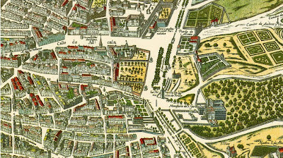
At about the same time (1574, to be exact), the Count of Barajas was laying out the Alameda de Hercules in the north end of Seville (alameda originally meant a poplar grove). This was an elaborate, aristocratic space from the beginning, with its avenues of poplars, fountains and twin columns, recycled from a Roman temple and topped with statues of Hercules, Andalucía’s mythical founder, and Julius Caesar, who had briefly been Roman governor here. For centuries it was the place to be in Seville. Though it went down a bit, especially after the Civil War, when it gained a bad reputation as the city’s drug market, it has recently been elegantly restored, and it is regaining something of its old cachet.


In a time when nothing like a public ‘park’ had yet been seen, the Prado and the Alameda were a sensation, and other Spanish cities soon picked up the habit, such as Burgos, with its riverfront Espolón. Over time, the form could become a city’s centerpiece; southern cities like Granada and Palma de Mallorca have pretty strings of them winding through their city centres.

Of course, in the Catalan parts of Spain an alameda is a rambla, and Barcelona was to build the most celebrated of them all, the ‘most beautiful street in the world’, as García Lorca claimed. A ramla was a torrent or stream in Arabic, and nearly all of the Catalan ramblas cover old streams that had degraded into stinky open sewers—Barcelona’s, where tourists flock today, was once a sardonic joke, called the Cagal.lel, or ‘turd-taker’.

It’s the linear nature of the alameda or rambla that makes it such a delightful urban amenity. You don’t have to come so far for the park; the park comes to you. Some benches and two shady rows of plane trees are all the decoration you require. Since it’s usually one of the main thoroughfares of town, it can take you where you’re going. And if you’re not in a hurry, you can take a seat and watch the people going by. A lot of Barcelonans make a point of taking a stroll on the Ramblas every day, and in summer they secretly wish that all the tourists would go away so they could have it to themselves. They’re so fond of it, it may be the only street in the world that’s been turned into a verb: to do the Ramblas, in Catalan, is to ramblejar.

Free Voina!


photos flagrantly lifted from Fatcap, a wonderful site dedicated to street art all over the world.

­­
While we’re on the subject of public art, a tip of the hat to Voina, a Russian dissident art group that has been standing up for freedom in the most surprising ways.

One of Voina's symbols is a blue bucket, to mock the cop lights that big shots put atop their cars when they want to breeze through Moscow traffic. They like to put buckets on their heads and run over the villains' limousines, when they can catch one. The police are their special targets, and they made all Moscow laugh when they turned over six police cars in a single night—police cars with drunken, sleeping cops inside.

One member made the news for smuggling a chicken out of a supermarket in her vagina, for reasons not entirely clear. Voina has staged brief occupations of police stations, and a naked orgy in the State Museum of Biology. They also once put on an impromptu punk concert in a courtroom during a dissident trial, playing a catchy tune called ‘All Cops Are Bastards’. On Che Guevara’s birthday, they even stormed the Russian parliament, and manage to storm right out again and get away before the police could appear, leaving their calling card in laser projection on the building’s wall.

They‘ve been bailed out on one occasion by Banksy himself, who has contributed over £ 80,000 to their cause. Voina’s greatest exploit, so far, was the erection, so to speak, on the Liteiny drawbridge in St. Petersburg in June 2010. The 65-ft dick was pointed directly at the offices of the Russian regime’s heavies, the Federal Security Service. If the art seems a little careless, it was painted under duress. The Voina artists had to run with their paint cans while the bridge guards were chasing them, and they still managed to get the job done.

The Russian authorities, understandably, are not amused. But this isn’t the old days, and they’ve treated Voina members with just about the same measure of casual brutality and robust prosecution that they could have expected in, say, the United States. Most of the leaders are in jail right now; some are still awaiting trial for serious charges. They could use a little support.


The ‘Bulgarian Banksy’ strikes


This corner has already expressed its open-eyed wonder at the ever-changing world of public art, and we’re always glad to see new nations adding to the possibilities for non-official fun. And we’re always glad for news from Bulgaria, the land of attar of roses and music in 11/8 time. Back last June, a prankster they’re calling the ‘Bulgarian Banksy’ struck at the Monument to the Soviet Army in Sofia.


photo from SophiainBulgaria blog

From left to right: The Mask, The Joker, The Wolverine (who’s he?), Santa, Superman, Ronald McDonald, Captain America, Robin and Wonder Woman. The graffiti underneath says: ‘In step with the times’ (you can see more here).

Almost immediately, Bulgarian and international artists ginned up a campaign to preserve the new paint job, but that wasn’t very likely to happen. The Russian bear never growls louder than when one of its Stalin- or Khrushchev-era war memorials is attacked, which in the former lands of the Warsaw Pact is about once ever fifteen minutes. Plenty of people in those countries still remember what life was like in the decades after their ‘liberation’ from the Nazis. City officials often dismantle them or hide them away in playgrounds in gypsy neighborhoods whenever they can get away with it; younger folk use them for perfecting their spray-paint technique. The big city centre ones, like Sofia’s, have usually been sacrosanct. Nobody wants to poke a bear.

Officials vowed the perp would have to clean the monument personally, but even as they spoke government crews under the lash were hurriedly blasting off all the paint. They made a hash of it, at last report there are still orange and bluish splotches all over the thing. The artist remains at large.